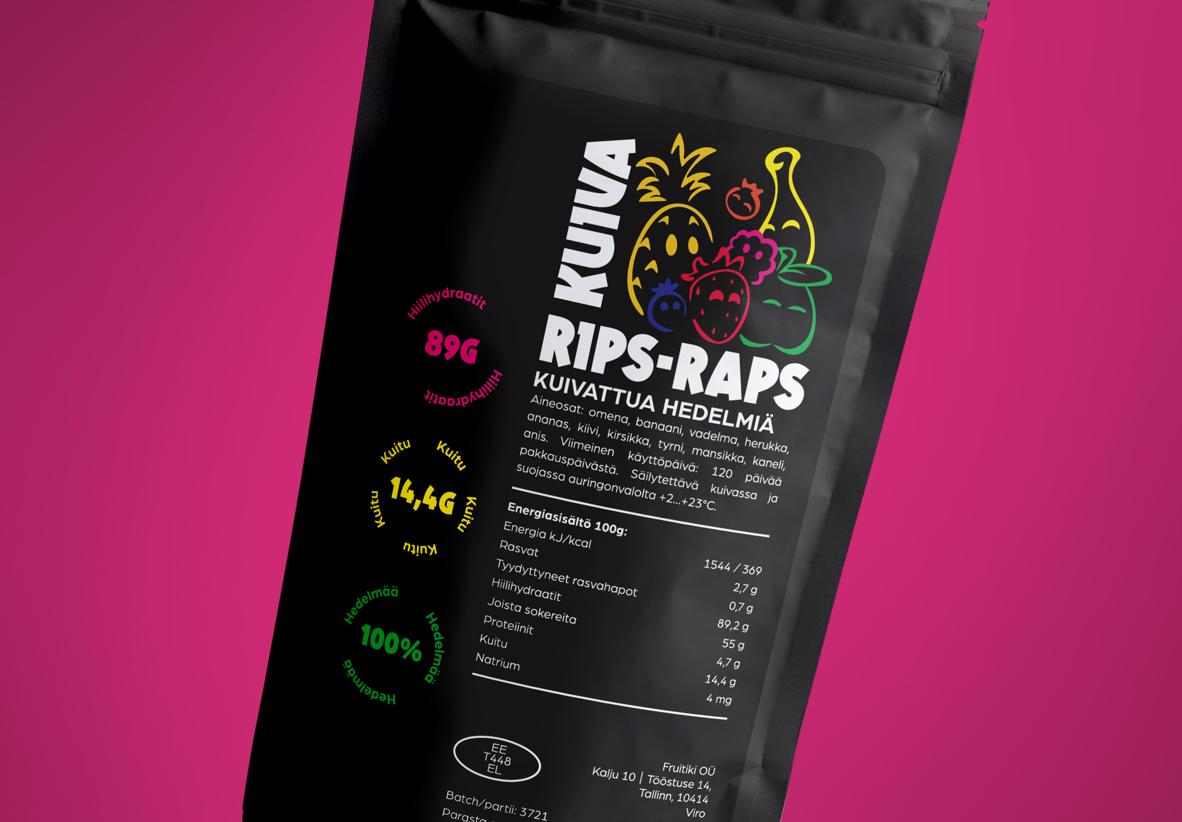
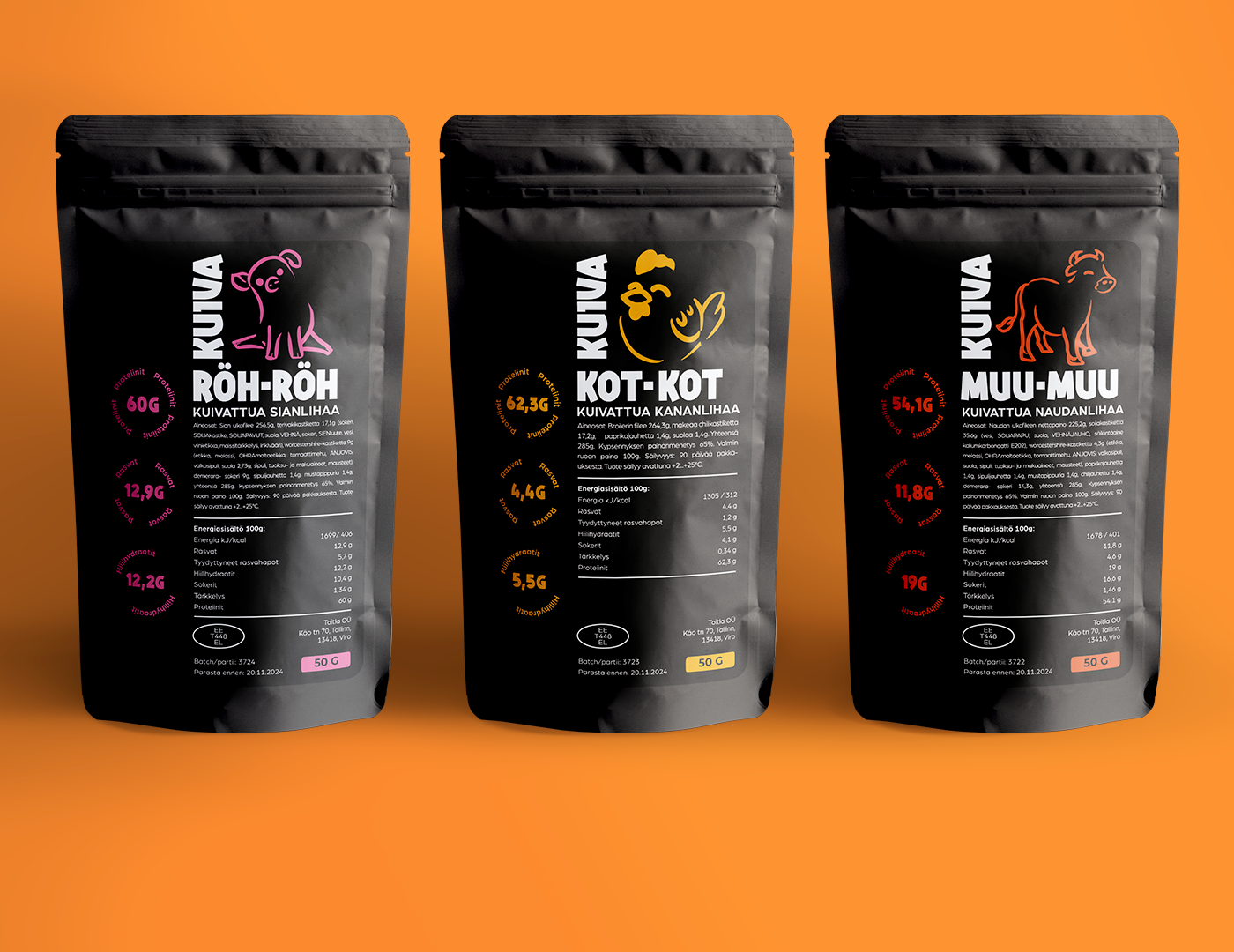
For the packaging design, we wanted to capture a sense of playfulness and simplicity, emphasizing the premium quality of these snacks. The target audience are families and friends, who visit Vuokatin adventure park.
The vibrant color palette brings a color contrast with the black bag, making it pop. The clean grid gives a sleek appearance. Illustrations on the packaging depict the various types of meat or fruits used in each product, maintaining the playfulness of the design. As of now, the packages are green lit and in the production.
Client: Vuokatin Seikkailupuisto

