CLIENT:
PRIIT PÄRLE
YEAR:
2025
PROJECT:
BRANDING

branding - st[æ]ger
about.
St[æ]ger is a studio that manufactures innovative apple boxes, that are becoming more popular tools for photography and filming industries. I was approached with the task to figure out the brand, its voice and create a mini CVI - containing logo, primary/secondary colours, grid system and some example mockups.


challenge.
From the very beginning it has been established that the logo should be designed around the iconic [æ] symbol. For the visual identity, it seemed that nordic modernity, that is clean and timeless, was the correct tone for the brand.
Optima typeface was perfect to capture the brand’s innovative spirit and technical precision. It was also used as primary font. Neue Haas Grotesk serves as st[æ]ger’s secondary typeface for its readability and modernity.
The colour palette of pale white, dark blue and orange creates a harmony that is recognisable in its field of expertise. There are two types of elements that represent the characteristics of st[æ]ger brand: silouettes of the apple box and bracets in the texts.
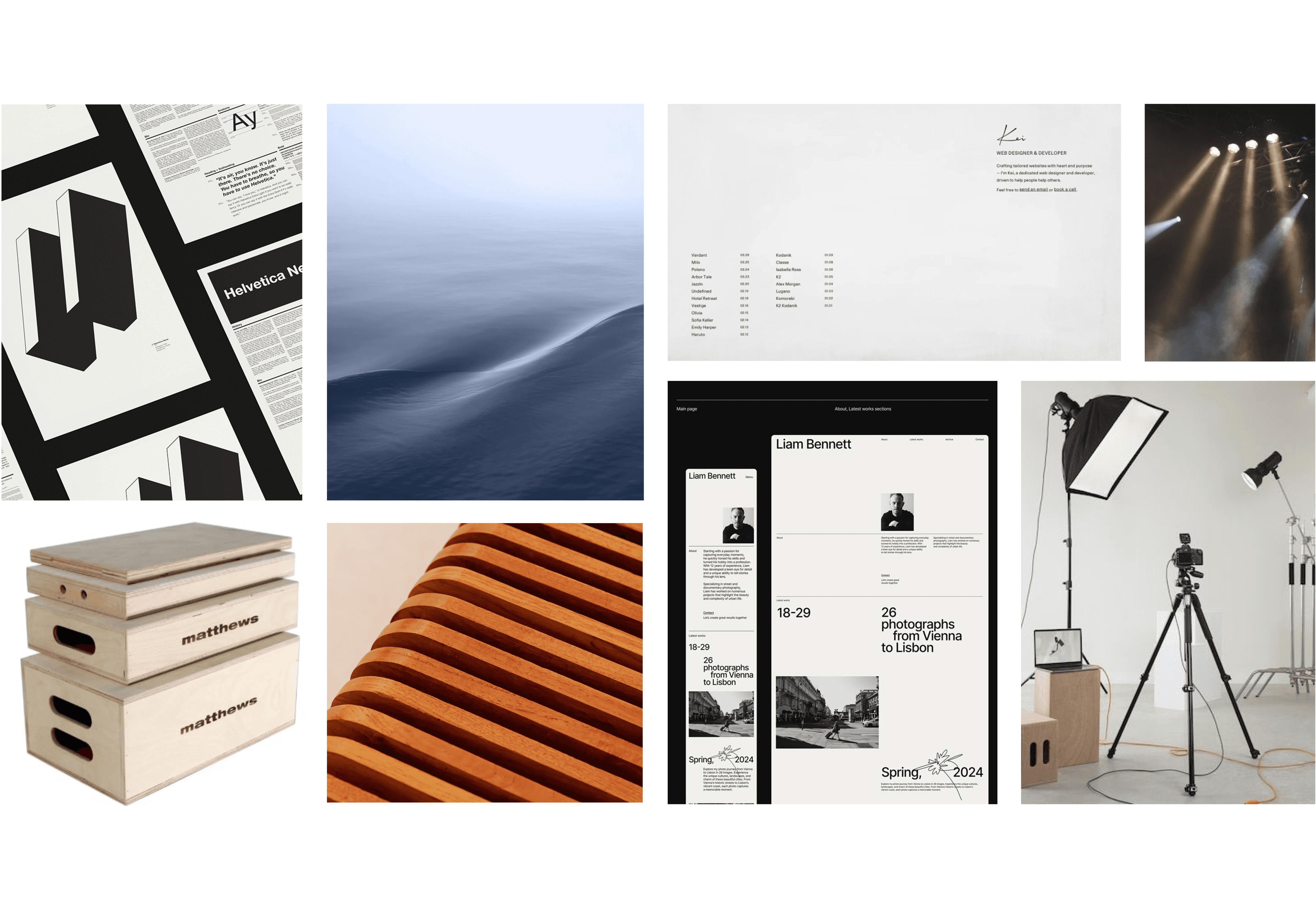


result.
Designing st[æ]ger meant finding the sweet spot between modern innovation and timeless craftsmanship. When putting it all together, the spirit of st[æ]ger has been successfully captured, showing visually the quality it holds and stands out clearly from the competitors. For the next year, the work will continue to bring the whole brand to life.


